


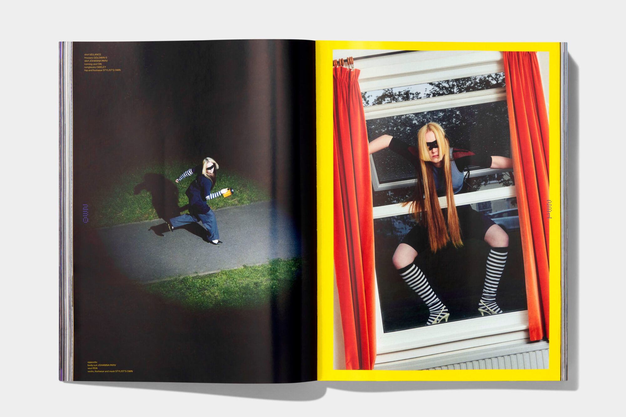


We partnered with Orienteer Mapazine, a pioneering fashion magazine and creative agency, to evolve their brand identity and publication format. The project began with a comprehensive update to their brand identity, where we meticulously refined their logo to enhance symmetry and detail, aligning it with the high production value of their content. Recognizing the need for a more expansive canvas, we transitioned the magazine from its original one-page fold-out format to a larger, long-form design. This overhaul not only marked a significant milestone in the brand’s development but also allowed their editorial work to be presented in a way that truly reflects its elevated nature.
Our collaboration with Orienteer also involved the creation of bespoke typefaces inspired by cartography and exploratory design principles. These custom fonts incorporated elements of technical and futuristic fashion, resonating with the magazine’s innovative approach to styling and photography. The typefaces served as a visual bridge, linking Orienteer’s experimental editorial content with its brand ethos. This integration of unique typography further distinguished the magazine’s identity, reinforcing its position at the cutting edge of fashion and design.
Throughout this process, we maintained a strong focus on preserving Orienteer’s original concept—the Mapazine. Each issue continues to feature a fold-out map within the publication, which includes editorial content, brand collaborations, and a specially designed print poster on the reverse side. This nod to Orienteer’s origins ensures that while the brand grows and evolves, it remains firmly connected to its foundational vision. Additionally, we ensured continuity across their social channels and collaborations, aligning their digital presence with the newly refined identity and extended publication format.
